Rethinking Form Design with Conversational AI
An overhaul of the request journey, interfaces, automations, and process flow, for associates who request Cybersecurity help, and the associates who fulfill the requests.
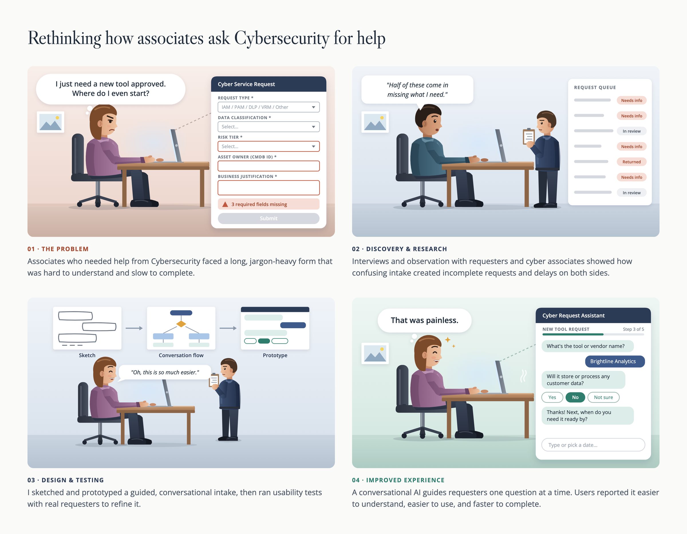
EXPERIENCE GAP(s)and OBJECTIVE
Associates who needed help from Cybersecurity faced a long, jargon-heavy form that was hard to understand and slow to complete. It was easy to pick the wrong request type, or even the wrong form entirely.
Interviews and observation with requesters and cyber associates showed the cost. Requests arrived filled out incorrectly, so the support team spent their time going back to requesters for clarification, or telling them they had used the wrong form and to start over. Delays built up on both sides.
Objective
Make it easy for any associate to ask Cybersecurity for help and get the request right the first time, so that:
- Submissions arrive complete and accurate
- Support spends less time on clarifications and rework
- Requests are turned around faster
Measuring Success
Success was measured by the accuracy of submissions, the number of follow-ups to requesters, and overall turnaround time.
OUTCOMES and IMPACT
The newly designed interface reduced confusion and manual work. Requesters said the new process was easier to understand, easier to use, and faster to completeThe support team received requests they could act on and turnaround faster.
THE DESIGN SOLUTION
I replaced the form with an AI-guided, one-thing-at-a-time flow, in the spirit of TurboTax. Instead of asking requesters to decode request types and policy terms, the first screen simply asks them to describe what they need in their own words. The system assesses the request, routes it to the right support team, and asks only for the extra details it still needs. Every question is conversational in tone, grammar, and structure, so it reads like a person asking, not a form demanding.
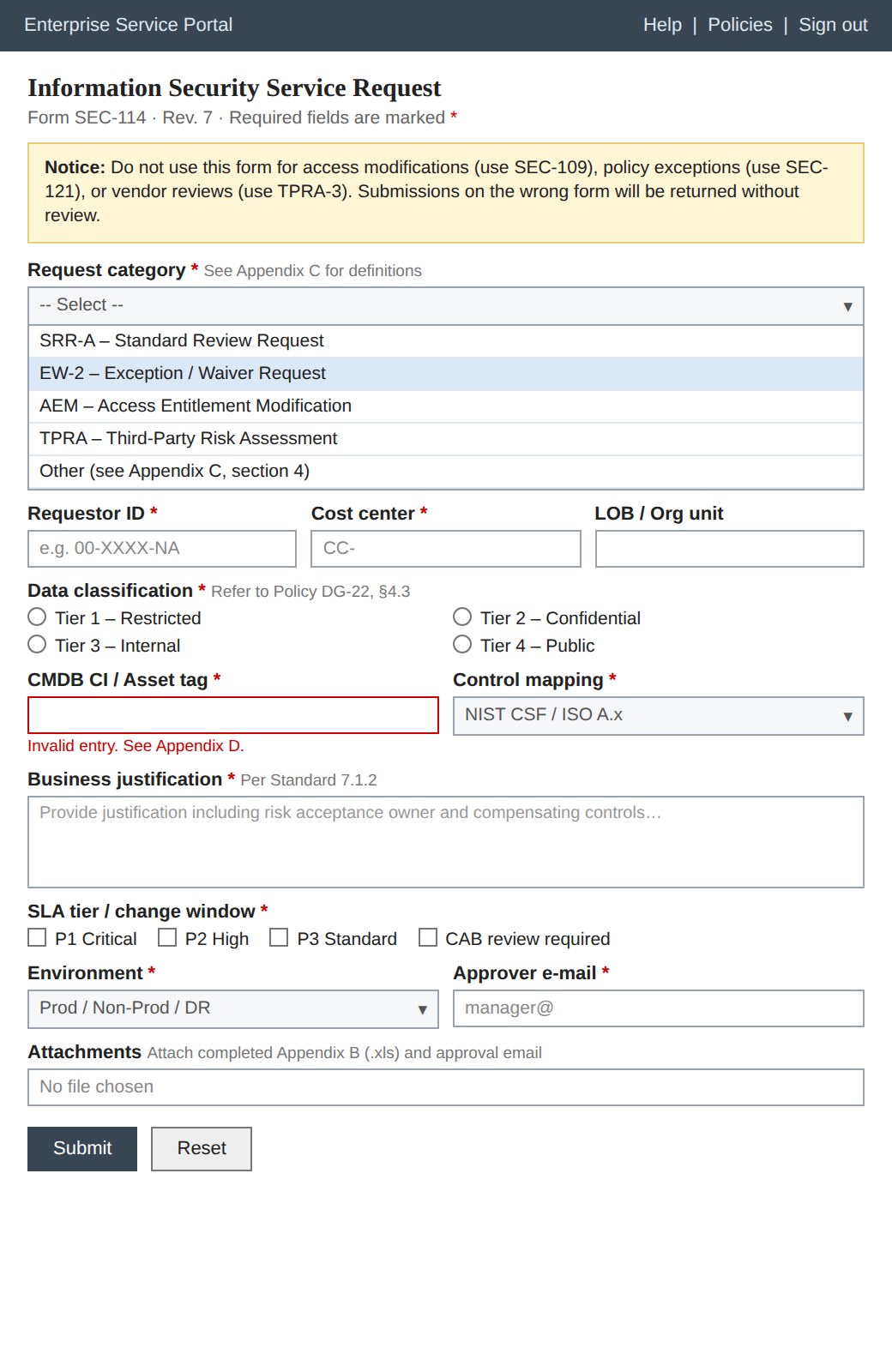
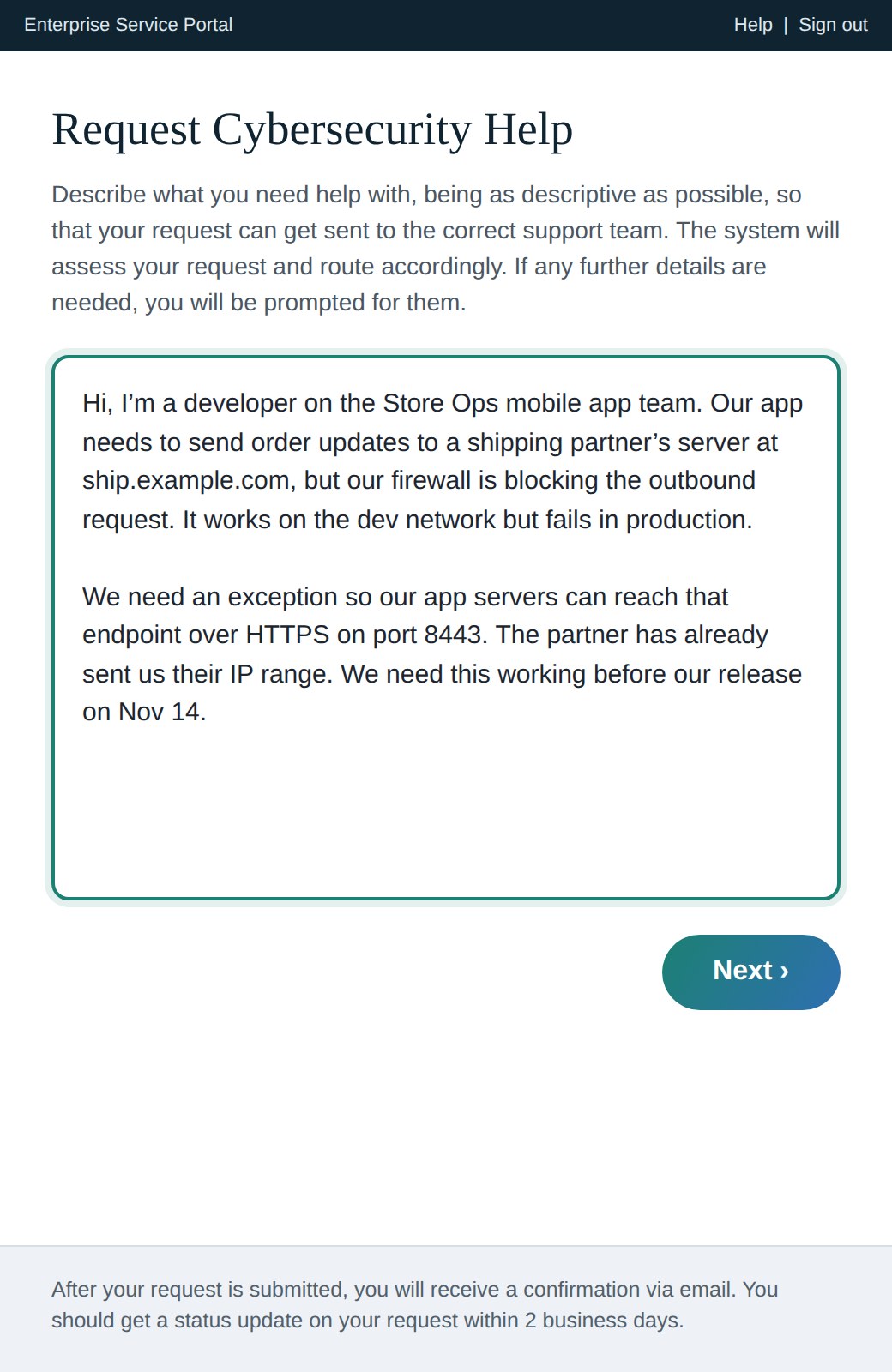
The actual product screens are proprietary. These images are representative samples created for this portfolio.
APPROACH, EFFORT, and ARTIFACTS
I led the project end to end as the UX lead, owning the research, the question flow, the interaction design, the content, and the development orchestration.
Understand both sides of the request
I interviewed and observed requesters and cyber associates to see how requests were made, where they went wrong, and what it cost the people on the receiving end.
Design the flow and the language
I moved from sketches to a question flow to a working prototype of a guided intake that shows one thing at a time and words every question conversationally.
Test with real requesters
I ran usability tests with real requesters and refined the flow and the wording based on what they found easy or confusing.
Orchestrate the build
I worked with the development team to build and launch the new flow, so the design that shipped matched the design that was tested.
- Interview and observation findings from requesters and cyber associates
- Sketches, question flow, and prototype
- Usability test findings
- Question content: conversational wording for each screen, answer choices, and confirmation messaging
LEARNINGS
- Fix the experience, not the form. The problem wasn't the layout of the fields. It was that requesters had to know terms and categories they had no reason to know.
- Design for the person on the receiving end too. Getting requests right the first time saved the support team as much effort as it saved requesters.
- Plain language is a feature. Asking one conversational question at a time lets the system collect what it needs in the requester's words and work out the rest.